Lately, I've read a couple of those "Design Don'ts" lists. While I usually gloss over those cheeky experts, when they include snide comments about some of my favorite things, I must disagree. I'm being lazy today and using photos found on Houzz (in a completely permissible embedded way to use the photos of others).
Here are the worst offenders:
1. 'Don't karate chop your pillows.' This is baloney.

by
Westport Interior Designers & Decorators
I love a karate chop on a quality pillow. In the photo above, it relaxes those chairs a bit.

by
Cambridge Architects & Building Designers
Doesn't have to be a deep chop. On the bed above, look at that gentle chop on the back pillows. Nice.

by
Philadelphia Interior Designers & Decorators
Oh baby, what fab colors. Chop away! It looks great!
2.
'Don't use a painted accent wall.'
This is salami.

by
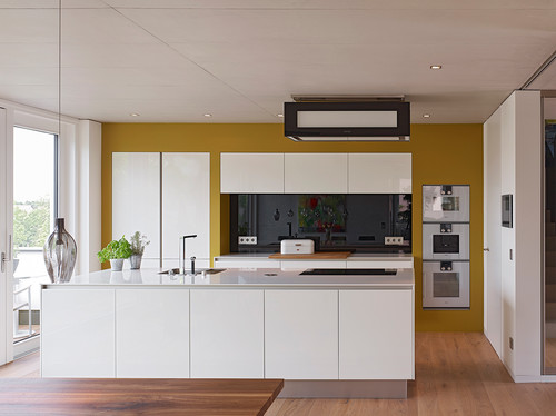
This kitchen is beautiful, but the accent wall makes it a showstopper. Without that shot of color, it would be yet another white kitchen.

by
Toronto Architects & Building Designers
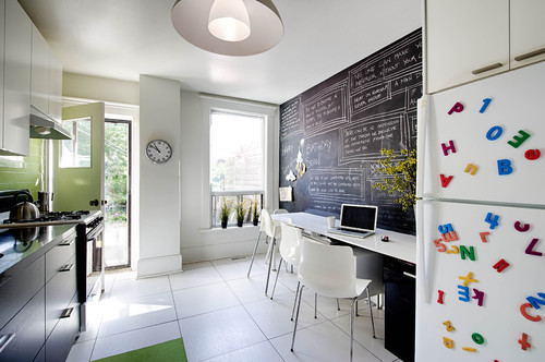
A chalkboard wall is alwaysgoing to make me smile. This added so much personality to the space.

by
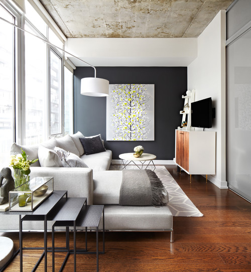
A painted accent wall should draw your eye to something special. The artwork above would have been kind of lost if all the walls were white.
3. 'Don't use "busy" patterns on window treatments.' Now they've really gone too far!

by
Kennesaw Interior Designers & Decorators
Kandrac & Kole Interior Designs, Inc.
I see the shape and layout of the room above a lot. Those "busy" drapery panels pull the eye all the way through and soften up any hard lines in the space (Mr. TV, I'm talking about you).

by
Oakton Interior Designers & Decorators
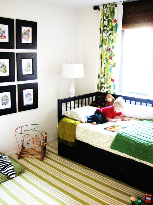
Doesn't this room just steal your heart? It's a modern, gender neutral child's bedroom that would be nothing special without that bold pattern on the drapery panel. It POPS! Oh yeah, the snoots don't want us to say "pop" anymore either.

by
Toronto Architects & Building Designers
Ok, I'm not a big fan of that chair, but those boldly patterned drapes are warming up the appearance of this room like nobody's business. The bed is beautiful. They really should have gone a little further and added roman shades to those small windows in the same fabric.
Please don't listen to the naysayers with all of their Don'ts. Good design depends heavily on lots of "Do's." DO what you like. DO pay attention to scale. DO add something fun to every room.
Just remember, your home should make you smile!
Ciao,
Anne


