Chapel Hill

Working From A Home Office

The home office is a fab thing.

Mine is big, with great windows and loaded with what I need to do my job.  But guess where my favorite desk is?

working from a home office

At the kitchen counter!  It's my version of a standing desk. When I get tired of standing, I move to the kitchen table.  Files aren't nearby, but  I can easily climb the back stairs to the "real" office (which I do many times during the day)-and that gives the added bonus of a little exercise.

Plus, I'm near the snacks.  It works for me!

Ciao,

Anne

Flower Power and Gratitude

  "I don't have to chase extraordinary moments to find happiness - it's right in front of me if I'm paying attention and practicing gratitude."  Brene Brown

That Brene Brown quote is so incredibly true and exactly how I felt after walking around the yard this morning.  We've got 2 acres here and every plant on it makes me incredibly happy.  If I don't pay attention, things will bloom without me!

I know I show you pictures of Casa DeCocco often.  It probably always looks the same to you.  But I see differences every day and I am in love with this sweet cottage.  Look at the fig tree over there on the corner of the front porch!  It's going to be HUGE again this year!

The side yard has benefited from lots of rain.  Grass doesn't usually grow there, and it will be gone as soon as the hot, dry weather sets in.  But I like the wild look of this spot.  It feels like the entrance to the forest.

The Annabelle hydrangeas are coming along nicely in front of the living room window.  Soon the big white flowers will fill the window!

The front porch is almost ready for me to hang up the Boston ferns.  First we need to wash away all the yellow pollen. Soon!

Gardeners out here call Hostas "crack for deer."  The only way we get to see it is if we fence it in.  I call it the Hosta Jail.  Sorry fellas--this is Hub's idea.

I've only got 2 surviving peonies, and this is one of them.  Peonies are my favorite flower.  Every year I say I"ll plant more.  Maybe this year?  The garden is in too much shade to grow veggies successfully so maybe I can have a peony garden, with enough to cut for bouquets without guilt.  Decadence!

This daffoldil is a late bloomer, and there's nothing wrong with that.  All the other daffys have dried up, so this beauty gets all the attention.

Now I'm off to pack for High Point.  The International Home Furnishings Market has started and I'll be there tomorrow morning.  I'll let you know if we find anything you can't live without!

Ciao,

Anne

Latest Design "Don'ts" that I DO NOT agree with!

cranky teacher

cranky teacher

Lately, I've read a couple of those  "Design Don'ts"  lists.  While I usually gloss over those cheeky experts,  when they include snide comments about some of my favorite things, I must disagree.  I'm being lazy today and using photos found on Houzz (in a completely permissible embedded way to use the photos of others).

Here are the worst offenders:

1.  'Don't karate chop your pillows.'  This is baloney.

Traditional Living Room

by

Westport Interior Designers & Decorators

Susan Glick Interiors

I love a karate chop on a quality pillow.  In the photo above, it relaxes those chairs a bit.

Eclectic Bedroom

by

Cambridge Architects & Building Designers

LDa Architecture & Interiors

Doesn't have to be a deep chop.  On the bed above, look at that gentle chop on the back pillows.  Nice.

Eclectic Living Room

by

Philadelphia Interior Designers & Decorators

Caitlin Wilson

Oh baby, what fab colors.  Chop away!  It looks great!

2.

 'Don't use a painted accent wall.'

 This is salami.

Contemporary Kitchen

by

Other Metro Architects

AMP Architekten

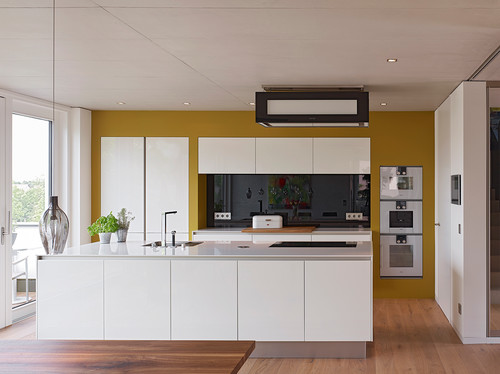
This kitchen is beautiful, but the accent wall makes it a showstopper.  Without that shot of color, it would be yet another white kitchen.

Contemporary Kitchen

by

Toronto Architects & Building Designers

Affecting Spaces

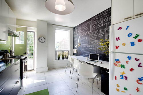
A chalkboard wall is alwaysgoing to make me smile.  This added so much personality to the space.

Contemporary Living Room

by

Toronto Photographers

Lisa Petrole Photography

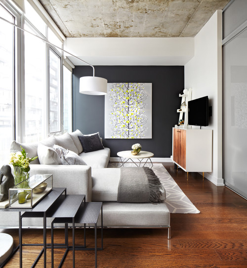
A painted accent wall should draw your eye to something special. The artwork above would have been kind of lost if all the walls were white.

3.  'Don't use "busy" patterns on window treatments.'  Now they've really gone too far!

Transitional Living Room

by

Kennesaw Interior Designers & Decorators

Kandrac & Kole Interior Designs, Inc.

I see the shape and layout of the room above a lot.  Those "busy" drapery panels pull the eye all the way through and soften up any hard lines in the space (Mr. TV, I'm talking about you).

Eclectic Kids

by

Oakton Interior Designers & Decorators

Lauren Liess Interiors

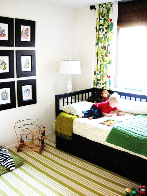
Doesn't this room just steal your heart?  It's a modern, gender neutral child's bedroom that would be nothing special without that bold pattern on the drapery panel.  It POPS!  Oh yeah, the snoots don't want us to say "pop" anymore either.

Transitional Bedroom

by

Toronto Architects & Building Designers

Collage Designs

Ok, I'm not a big fan of that chair,  but those boldly patterned drapes are warming up the appearance of this room like nobody's business.  The bed is beautiful.  They really should have gone a little further and added roman shades to those small windows in the same fabric.

Please don't listen to the naysayers with all of their Don'ts.  Good design depends heavily on lots of "Do's."  DO what you like.  DO pay attention to scale.  DO add something fun to every room.

Just remember, your home should make you smile!

Ciao,

Anne