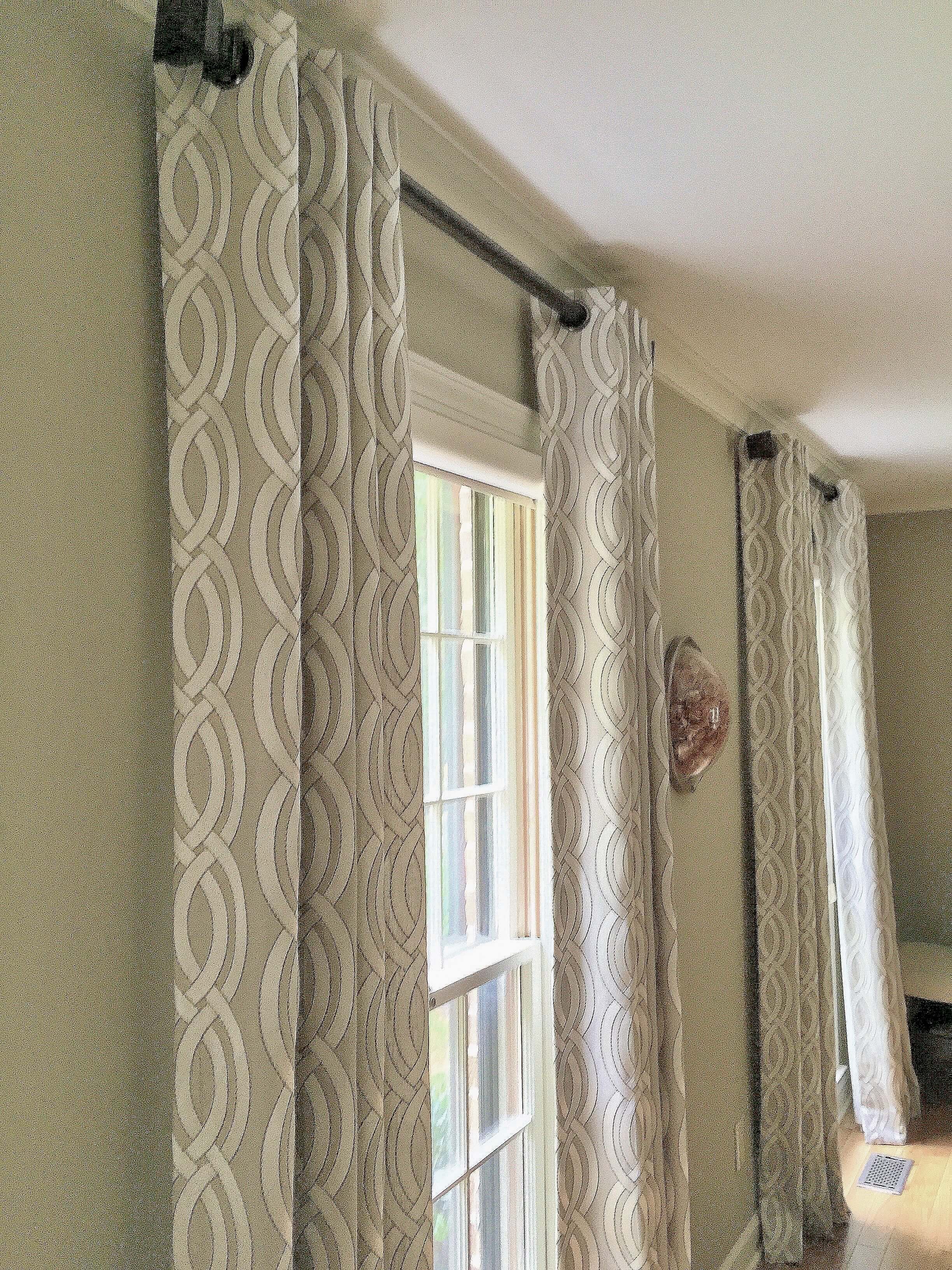
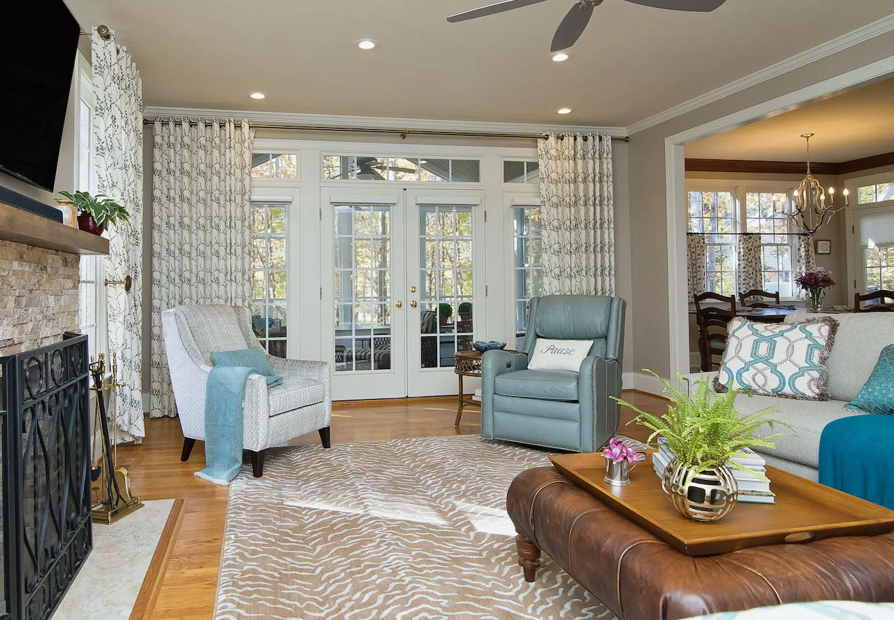
An ode to the misunderstood grommet header:
“Oh how they spurn and disdain you
Those masses who don’t see your beauty.
They’re missing your features,
Such short-sighted creatures!
And maybe they’re just being snooty.
Draperies with sweet grommet headers
Solve problems while looking so fab.
Giving bang for the buck,
They’ve made me starstruck.
Try them once in your home - you’ll be glad!”
Maybe by the time I hit “publish” on this post the poem will improve, but probably not. When I was MUCH younger, I could write a cute poem pretty quick. Alas, that talent has left me.
Today I’m writing about grommet headers on drapery panels. I’ve been loving them and using them in projects for a long time. I’ll show you why.
Catherine Nguyen Photography for DeCocco Design
I put them in this room because grommet headers work really well with contemporary or transitional spaces - like the mid-century modern style in this one. Another reason was that we didn’t have much wall space on the left side of the window. Grommet headers give a lot of control with the width of each panel.
Catherine Nguyen for DeCocco Design
Being able to control the width means that one pair of single-width panels can easily close over most standard windows. When using panels with a traditional pinch-pleated header style at the top, you’re lucky if each panel will stretch to cover 22-24” per side. That’s often not enough if the panels are hung wide outside the window to really show off the view.
Fly-Boy Photography for DeCocco Design
Grommets give a very clean look to the room. This is a lively room with a Southwestern vibe. Don’t those drapery panels look terrific (if I do say so myself)?
Catherine Nguyen Photography for DeCocco Design
All the photos in this post are of my projects. I’ve got lots more stashed in my files! I know about the power of window treatment to polish up a room.
These Guest Room windows have blackout shades installed to darken the room. They really only needed drapery panels to flank and soften things up. I like them to be installed as high up as possible and with 8’ ceilings in older homes, grommets are often the way to go. Since the drapery rod goes through the grommets, the fabric continues about an inch above the rod. This brings the eye up as far as possible.
Here’s a close-up of the fabric in the Guest Room. Don’t you just love the coral pattern?
Here I updated a window seat nook in a Family Room with an Arts and Crafts fabric in warm colors. I also added the new cushion and fun round accent pillows. Wouldn’t it be cozy to sit in this window with a cup of tea and a good book on a rainy day?
I also had the green Bradbury & Bradbury wallpaper installed on the fireplace wall. Are you loving how the fabric coordinates with the wallpaper? I never want a matchy matchy result - just coordination of color and patterns!
And because the curtain has a grommet header, it will easily slide over the whole window when desired.
These panels were installed in a young family’s dining room because we had very little space between the top of the window molding and the bottom of the crown molding. If we had hung the panels from rings below the rod, they would have been a bit below the molding. That’s a no-no in my book.
Young clients often love the grommet style because it’s much more updated looking than a standard pinch pleat. They’re “not your grandma’s” curtains, although I’ve put grommet headers in the homes of many a grandma too!
Style House Photography for DeCocco Design
The big window above didn’t need to be covered, but the beautiful view did need to be framed. In addition, drapery panels soften the whole room up, PLUS provide some sound absorption. These added some needed pattern to the room as well. Love them, love them, love them.
Catherine Nguyen Photography for DeCocco Design
Oh my gosh, this Guest Room came out so sweet and cheerful, didn’t it? The curtains close over the window to darken the room when needed. Blackout lining is key to making that happen in a bright window.
By the way, this room also illustrates that you don’t always need to hang anything over the bed. That white wall lets the other colors in the room take their star turn.
You saw this room in my last blog post, but I wanted to be sure you noticed these linen panels in the Master Bedroom. Again, I always specify a black-out lining in custom window treatments. It keeps the fabric color consistent from top to bottom and side to side.
When I offered full service interior design, I would often make a mock-up like the one above so my clients could have a visual of what the custom window treatments would look like. They’re an investment and it’s easier to move forward when you have an idea of the result.
Below is how those panels look today. They can close over the entire wall of windows. I put them on the single windows in the room too.
Style House Photography for DeCocco Design
This client LOVED color - can you tell? My photo doesn’t show it well, but the curtain fabric is orange with a pink undertone. Against those walls, the room just glows, day and night. She loves it and I don’t blame her.
This room in my current Florida project is obviously still in progress. I’m showing it to you because these curtains came from Target. You can definitely find curtains like these at really REALLY low prices. That way you can splurge on other items or in other rooms.
What we did to make them look good was to have 2 panels sewn together on each side. The biggest issue with most readymade curtains is that they often look skimpy. Yet they’re SO much less expensive than custom, so it’s still a huge bargain to buy double the amount of panels and have them attached and hemmed if needed. I think the seamstress charged about $50. The other windows I’ve shown you cost much, much more.
Remember what I said about using blackout lining in custom drapes? Can you see how the sun is filtering through the fabric? That’s why they’re called “light filtering.” Target (and others) also carry blackout curtains, also known as room darkening.
Since it’s not finished, I haven’t written about this Florida project yet, but there’s a picture of the very colorful Foyer in my first digital magazine. You can find it in this post. Wait until you see the whole space (we’re getting close)!
Six Cents Photography for DeCocco Design
What a room, right? So many fabulous details, including those drapes. Grommet headers! If you would like to read more about this room, go here.
Six Cents Photography for DeCocco Design
Look at this beauty. I put a pair on either side of a window wall in this gorgeous finished walk-out basement on a lake (framing the view). That fabric shows how well black and brown go together, especially when brightened up with some white. Hubba hubba.
Let me give you another look at one side of this project. It was one for the books. You can see more in this blog post.
Six Cents Photography for DeCocco Design
I think by now you can see why I love using drapery panels with grommet headers in many windows. They’re so beautiful and just the right vibe for those of us who like modern, clean lines, even in traditional spaces.
If you’re wondering how high and wide to hang these drapes, here’s some guidance. Remember what I said about the rod going through the grommets. The panel fabric is usually 1” above the top of the grommet and the rod sits right below the top of the grommet (read that slowly to let it make sense). Each window is a bit different, but these tips will help you get it right:
Let the top of the drapery panel sit an inch or two below the bottom of the crown molding on an 8’ or 9’ ceiling. Remember that you’re looking up at the panel, so this will look like the panel is just about touching the molding.
OR
Hang the rod so that the top of the panel is at least 6-8” above the window frame (if there’s room).
If there’s very little wall space between the top of your window molding and the ceiling, put your rod as high as you can.
AND
Let your rod extend at least 6” beyond the window molding on each side. If you need the curtains to be able to close over the window, you’ll need to do a little math to get the right number. Don’t let the panels end up looking like a sheet of fabric when closed. There needs to be some ripple room.
iI you’re really tight on wall space, use end caps instead of finials. If you’re really REALLY tight on wall space, use a wall socket that allows the rod to fit inside and takes up the least space.
It’s time to end this parade of lovely drapery panels with grommet headers. Have I made a believer out of you - or maybe you’ve always loved this style? If you have any questions, don’t hesitate to ask in the Comments.
With sparkle and texture,
Anne


