The Junior League of High Point partnered with Traditional Home magazine and put together one fabulous Showhouse. I visited with my friend, Carole, and took lots of photos. It will be featured in the October issue of Traditional Home--I'll remind you when it hits the stands. I took the pics (hence the hint of fuzziness) in this entire post, except the first one and the last one. Please don't use them without my permission.
The foyer set the tone for the entire home. Blue was a predominant color, gorgeous grass cloth wall coverings were used throughout and the primary metal finish color was matte gold. There was even a consistent shape found everywhere--the Greek key.
A close-up. The Greek key shape on the matte gold mirror frame and a gray grass cloth wall covering. These elements bring a classic foundation to any decor. They can look modern or traditional.
Grass Cloth wallcoverings Sunny yellow grass cloth wall coverings were in the Artist's Retreat. The yellow is kind of unexpected--it was my favorite (but I liked them all)!
This tiny ceiling was papered with a beefy grass cloth illuminated by the perfect light fixture. Ohhhh! Ahhh!
This rich blue grass cloth was in the Breakfast Room, right off the kitchen. You will want to see the whole room when the magazine hits the stands. It's incredible.
One more:
Grass cloth even backed the shelving along the upstairs hallway. I often suggest this to my design clients. It's so much more interesting than a white background!
Vignettes
A vignette in interior design is a masterstroke. It makes you stop and say "Oh!" or maybe "Aww!" A vignette gives a message, whether it's telling you that this is the place to party or the place to relax--or it might evoke a memory. The picture above shows a sweet vignette in the Dining Room that brings a smile because of the well named pillow. It's Marvelous!
Also in the Dining Room was this floral vignette. So pretty. The designers of Madcap Cottage have the sweet vibe down pat.
The Library was a gorgeous room full of dark paneling. This vignette lightened things up considerably.
Above is also in the Library. Wouldn't you love to work at that desk? I'd have to turn it around (but then would I get any work done--there's a pool out there)!
In another part of the house, this desk has a more modern look. I would use the iPad to read Facebook posts here. :-D
This vignette says "Sit down and have a cocktail!" It's a great example of proportion. I asked Carole to stand right there to give you a sense of scale (don't you love her booties?). Those are TALL lamps, but the ceiling is HIGH and the starburst mirror is BIG. They work together beautifully to command attention.
Oh lordy, this room made me a little dizzy, but in a good way! It was fun, fun, fun. Imagine that pattern on the walls, the lampshades AND the ceilings?!?! Even though that's a lot of black and white, the emerald green grounded the space.
Same room - Office/Guest Room. The fabrics on the chair and the drapes makes my heart beat wildly. The soft gray soothes all the pattern. Yeah, the room is crazy, but there are a lot of great design elements and ideas in it.
We're back in the Artist's Retreat. I supposed I wouldn't really put cream upholstery next to works-in-progress, but a Showhouse has an element of fantasy about it, so we get to suspend our everyday concerns about spills and stains. Can you see the Greek key on the pillow trim? And everything else
This settee was in the Daughter's Bedroom. I'm a big fan of the color raspberry. Come to think of it, I love the fruit raspberry, too. Raspberry pancakes, raspberry muffins, raspberry pie (the queen of pies)! But I digress.
Same room. Took this photo because the custom details are endless. They obviously have a great workroom!
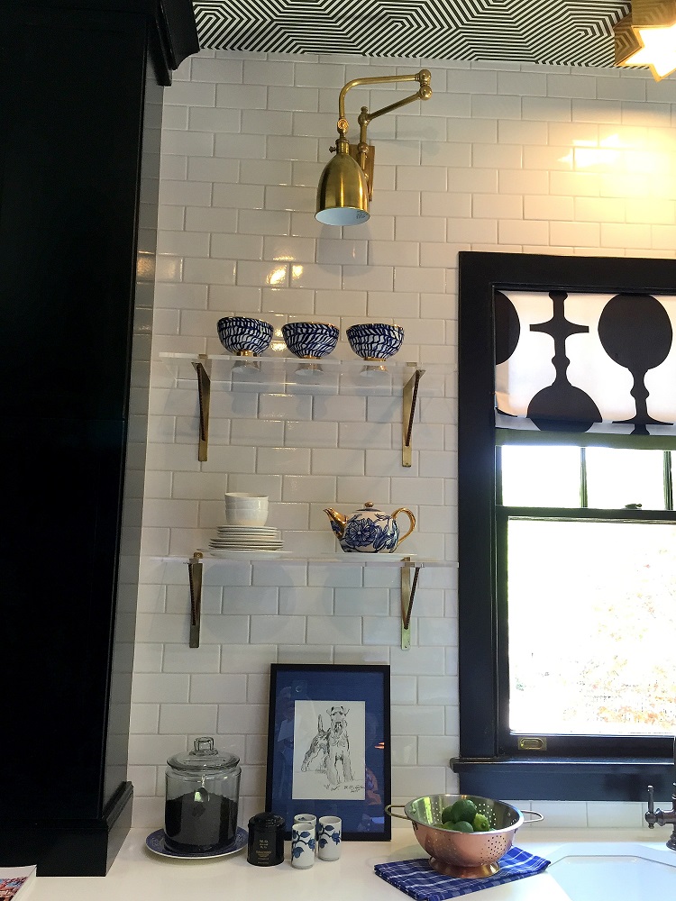
The kitchen, as I mentioned, was a showstopper, but my photos of that space aren't great, so I'll let the Traditional Home folks show it off in October. But here's a detail in the kitchen that made me swoon:
I'm a sucker for shelves and I love anything clear--glass, lucite, acrylic, plastic.
Look at these shelves. And the brackets. Perfection. I can't type because I'm busy swooning.
I enjoyed this kitchen detail as well. Simple cabinet pulls in matte gold. Last Fall at Market, when gold finshes had a strong introduction, I wondered how it was going to play out. It's everywhere and looks fabulous.
You didn't think I would skip the windows, did you? They were in every room, the use of great trims was nice to see--I touched every single one.
This was my favorite one and all because of the clear rods. I'm crazy for the clear. I've got these rods in my own house--I'll show them to you soon.
We stumbled upon this place for lunch. It was fantastic! Kind of like a Friendly's, which is my all time favorite lunch spot in the world. While we ate, Carole broke the news to me that Friendly's has closed all of it's locations. That was a bitter pill to swallow. I'm still a little shaken and can only hope that she can be proven wrong. But again, I digress.
Every good show needs a gift shop, and this one was no different. The gents at Madcap Cottage set up shop in a sunroom and had something for everyone to buy. This is what I chose:
Perfect!
Ciao,
Anne


