Oh my, I do love color! Here I am, standing amidst a fabulous art installation by the talented Holly Wong at the Visual Art Exchange in Raleigh. I visited it during an art crawl hosted by my very favorite professional organization, the Alliance of Interior Designers. Being in that room made me so happy!
I know there are too many choices when you’re looking for just the right paint color. I’ll make it easy for you by sharing the blue shades and white shades that I use over and over again.
If I’ve got a good picture of a room in the color in my portfolio, I’ll show it in this post. Otherwise, you can Google the color name and find plenty of walls in the color. However, please don’t ever decide on a color for your rooms based on a photo on a computer screen. Sample it on your own walls. I’m begging you!
Best blue paint colors
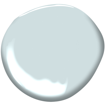
Sea Salt. This picture looks a bit more green on my computer screen than it should. Always sample paint before buying a gallon!
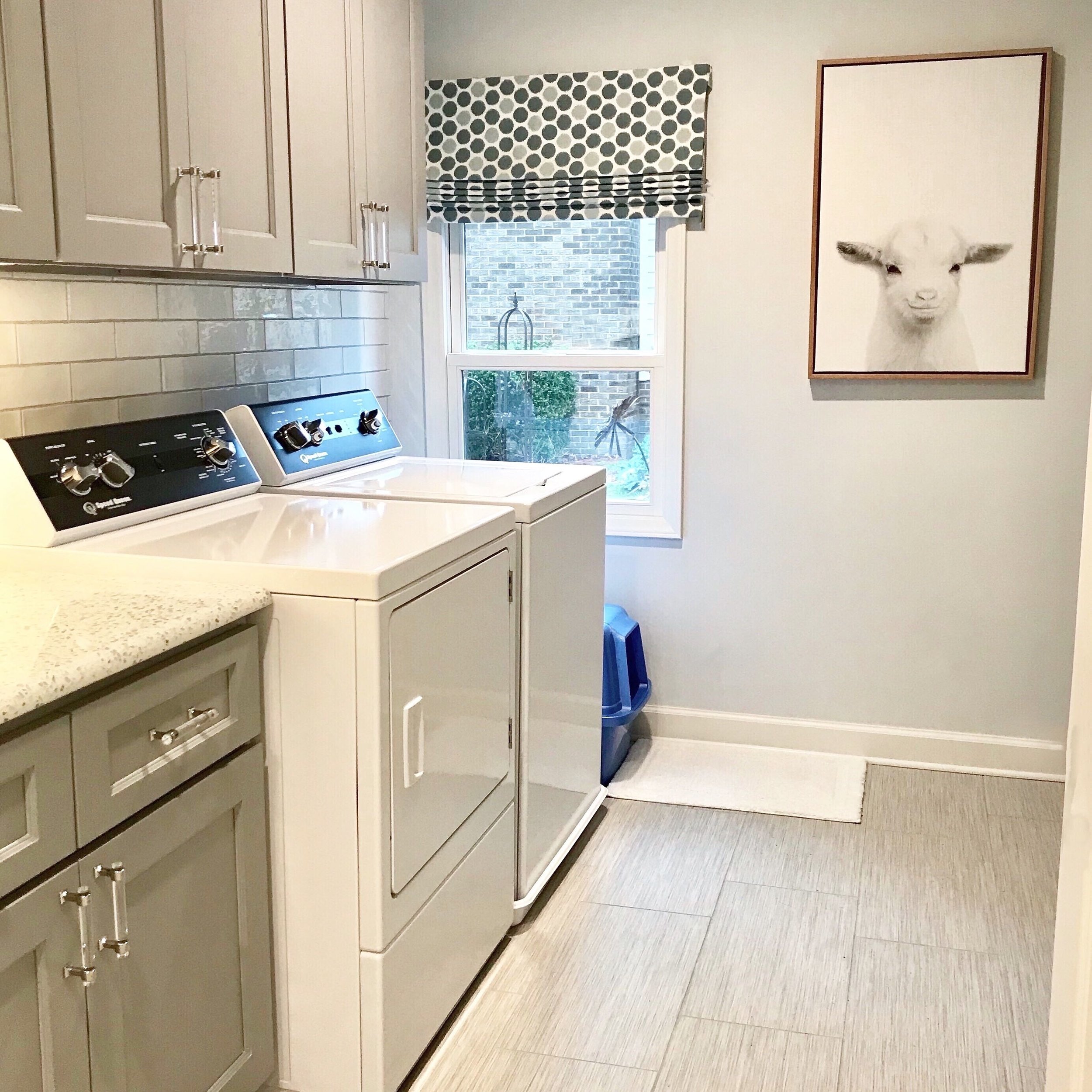
Here’s Sea Salt in a bathroom, looking very spa-like against marble and chrome.
Sea Salt by Sherwin Williams: to say this is a popular color would be the understatement of the year. It’s soothing and easy to coordinate with other colors and finishes. I love it in my master bathroom with the cool marble counters and chrome accents, but it’s just as pretty with warmer tones.
For me, Sea Salt has taken the place of an old favorite, Palladian Blue by Benjamin Moore. Speaking of Ben, do NOT get this one mixed up with Ben Moores’ Sea Salt, as that’s a completely different color!
Here’s another fantastic blue:
Silver Strand, Sherwin Williams 7057
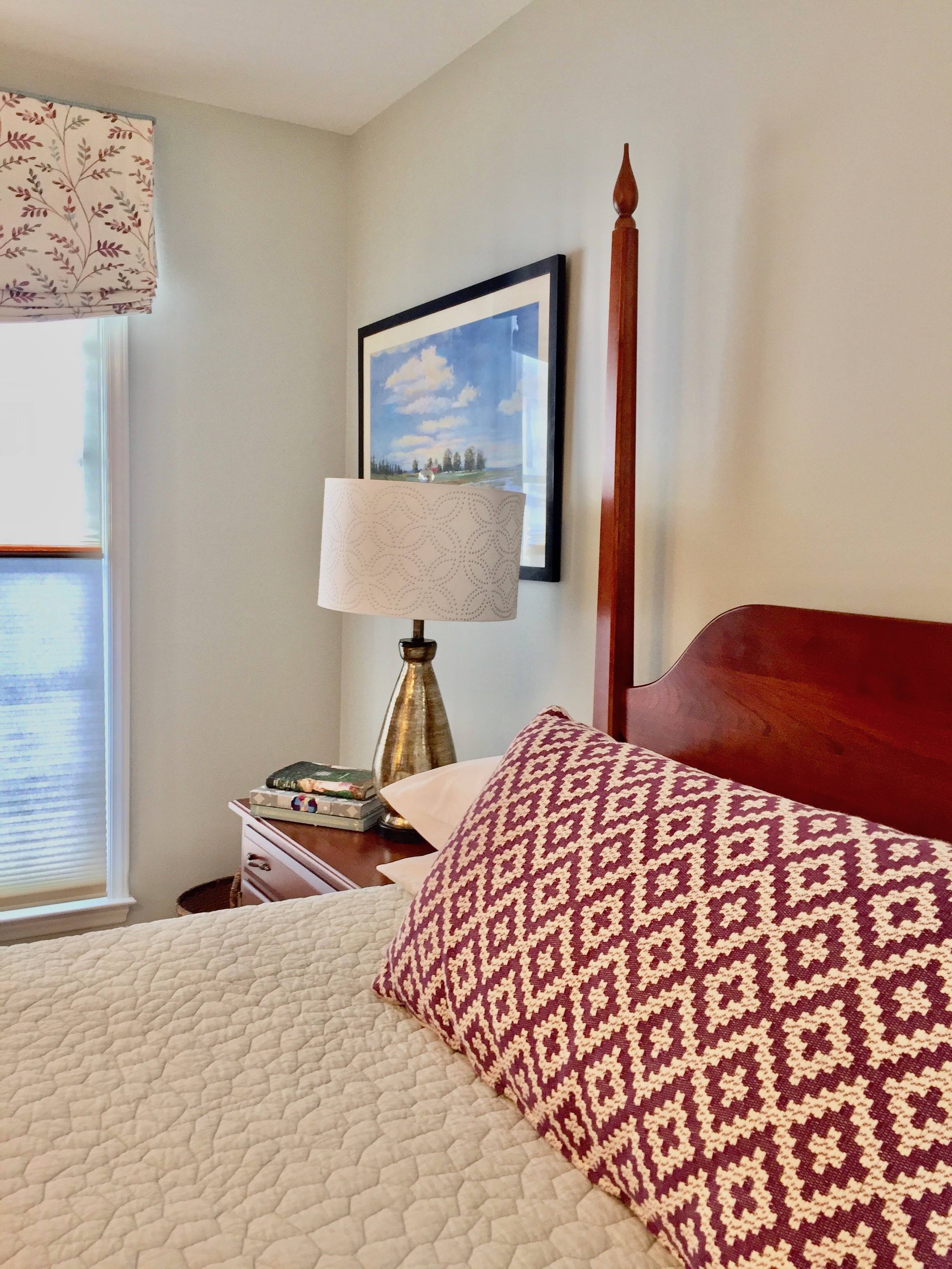
Here it is in a bedroom. I LOVED pairing it with some purple accents.
Silver Strand by Sherwin Williams. It varies a bit during different times of the day. Sometimes kind of gray, sometimes blue and sometimes a slightly green cast (a watery green, very nice).
Another blue:
Marilyn’s Dress, Benjamin Moore, 2125-60. Ethereal.
Marilyn’s Dress on the walls—and the ceiling which (sorry) you can’t see.
Marilyn’s Dress. If you want the softest blue that feels light and airy, choose this one. We had a laundry room and sun room painted this color—including the ceiling. It was a wonderful choice. It’s blue, but very subtle. I’ve put it on ceilings in several projects with fantastic results.
Another gorgeous blue:
Summer Shower by Sherwin Williams. 2135-60. If you want a true blue, this is your color. It has a smidge of a gray undertone, so it’s not quite a primary blue. I know it’s not trendy to paint a boys bedroom blue, but this color IS AWESOME in a boys bedroom. It coordinates easily with just about any other color and is very crisp against white trim. It would be great in an office, too.
Do you need a navy blue? Lots of cabinetry is being painted navy blue right now and it’s a lovely way to get a classic color in a room. Everyone seems to be ga-ga over Ben Moore’s Hale Navy. That’s a great shade, but if everyone likes it, I’m going to have to tweak it a bit. Why would you want what everyone has? Here are two that are even better:
Salty Dog. Wait till you see it on the walls!
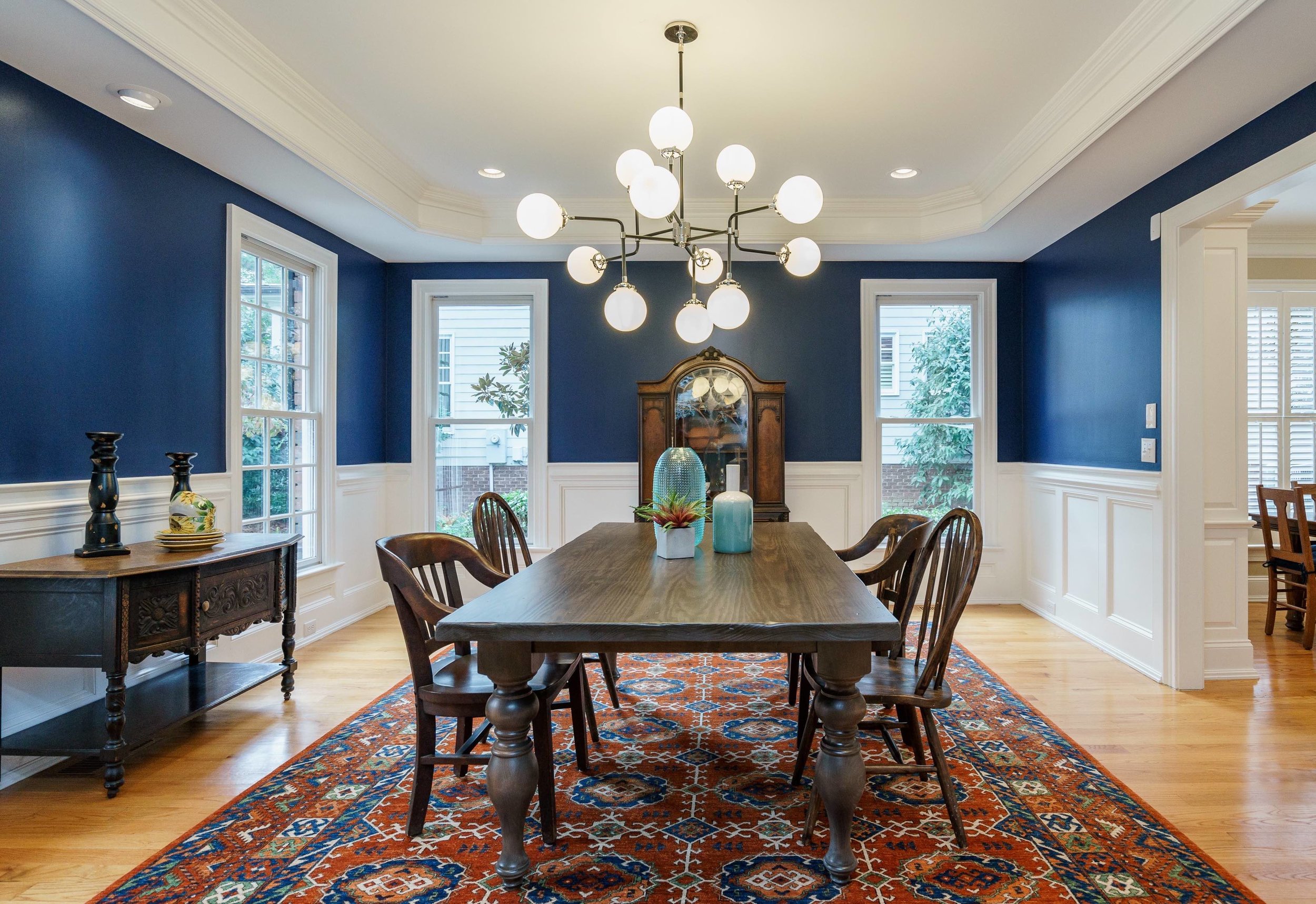
Sherwin’s Salty Dog (9177) is near and dear to my heart. I used it here:
Uh, yeah, it’s a show stopper! Those walls are not dark and moody. They’re happy and vibrant. Fabulous. These clients moved away before we finished the room, but it’s still such a beauty.
Another one:
Newburyport Blue, Benjamin Moore, HC-155.
If, however, you don’t want that much vibrancy and you really DO want a dark and moody blue, then Ben Moore’s Newburyport Blue is a better choice. It’s a dramatic, powerful, classic navy blue. And Newburyport, Mass., is one of my favorite places in New England!
Now let’s look at white paint colors. I don’t use white a lot, but when I do, it’s got to look good in all kinds of light. While I’ve specified a couple in projects, there are only two that ALWAYS work, especially for trim. We’ve got a ton of white trim going on here in North Carolina.
The first one might surprise you.
Best white paint colors
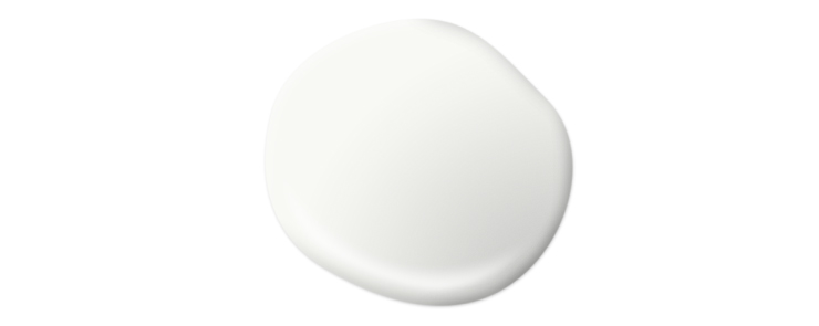
B1. The paint store will know what you mean. If it’s for your trim, please use a gloss finish. You’ll be glad you did.
My favorite white paint color is called B1. B1 is simply a formula; it means 1 drop of black in a gallon of white paint. It gives a great result, every time. Clean. White.
And my other go-to white paint color is:
Sherwin Williams Alabaster, 7008.
If you want to tone down that white just a smidge, I’d go with Sherwin’s Alabaster. It has the slightest (and I mean the slightest) gray undertone and looks fabulous in transitional or modern homes. It will still read as white, but not quite a traditional style white. That’s the best I can explain it!
And this is another one that you don’t want to confuse with Ben Moore’s Alabaster. That one has a slightly pink undertone. Sherwin’s is the one you want. Again, I love many Ben Moore colors. In this post most of my favorites just happen to be from Sherwin.
There - that wasn’t so hard, was it? Here’s a few more tips:
If you want an undertone of a color in your white, like a little pink or blue, just go to the fandeck or paint store and find the lightest shade of that color. Remember that if you’re using this on a ceiling it will go a tiny bit darker/grayer.
ALWAYS hold the paint swatch in the direction that it will be used. Holding it flat in your hand will never show the color correctly, unless you’re painting the floor!
Always buy a small amount of the color(s) with potential, take them home and paint a couple swatches— 2 coats please. Look at your swatches during the day, at dusk and at night. Buy good quality paint. Never the cheapest unless you have to. And if you think you have to, remember that it will probably take an extra coat to make the cheapest paint look good.
And I DON’T Like a flat finish. It’s easy to touch up, but hard to keep clean. Most of us need to clean off a mark every now and then on our walls, so go for a finish that lets you do that (which is not flat). Matte finishes are okay and low lustre to eggshell are my favorites on walls, gloss finish on trim.
I hope this has been helpful!
If you’re in the Greater Raleigh, NC area and would like a serious shot of help to get jump-started on your next home project (or pick your paint colors), take a look at my Services page. A 2 hour design consultation will give you direction, ideas and resources that will make a huge difference in the results that you get.
With sparkle and texture,
Anne


